

Lyft is everywhere when it comes to ride-sharing—they know how to get people moving. Lyft Business powers most of those rides, offering a full suite of transportation solutions for companies of all kinds.
Services
Strategy
Strategic workshops + alignment sessions
User Experience (UX)
Journey mapping & research
Information architecture & wireframes
Website Design
Design systems & scalable components
Interface and visual design
Motion Graphics
Responsive Web Development
Accessibility + inclusive design
2D/3D illustration + animation
CMS
SEO
Full-stack web development
CMS implementation (headless & traditional)
QA, performance + accessibility optimization
analytics & personalization

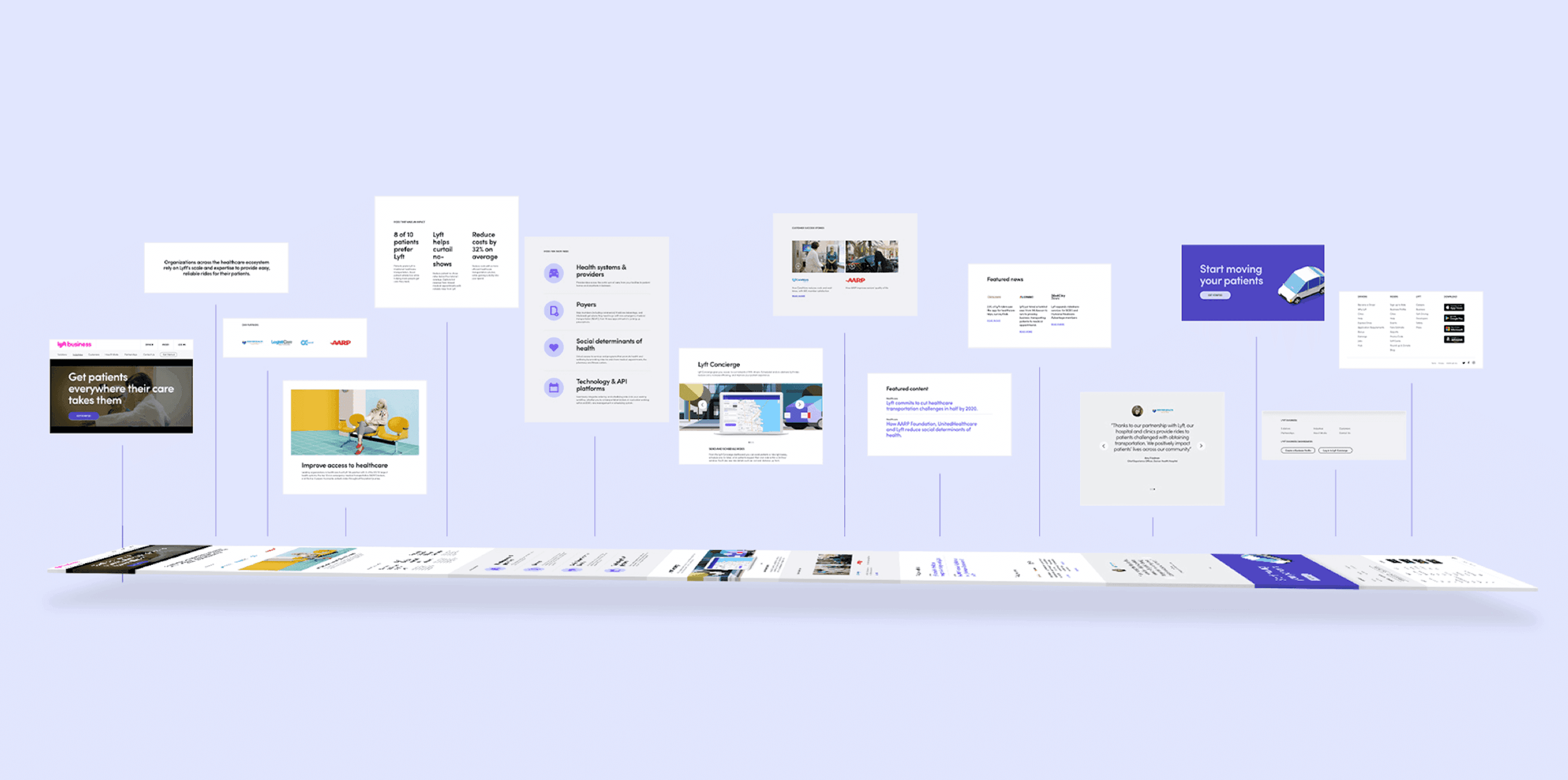
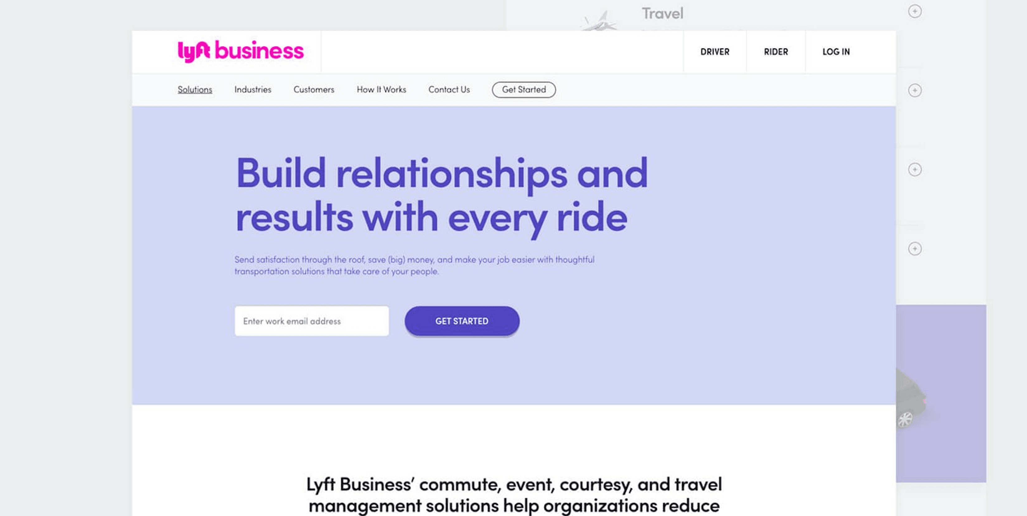
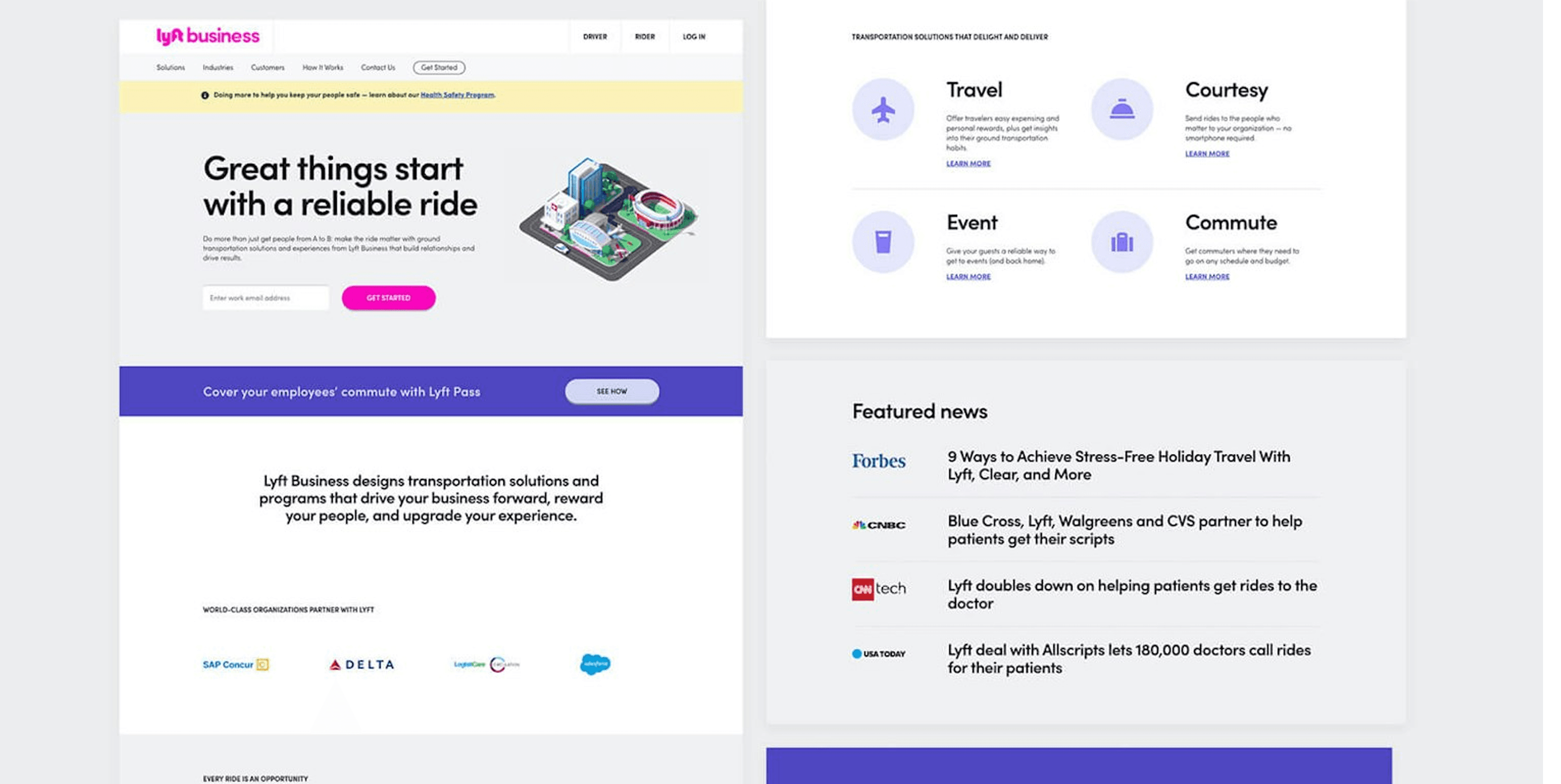
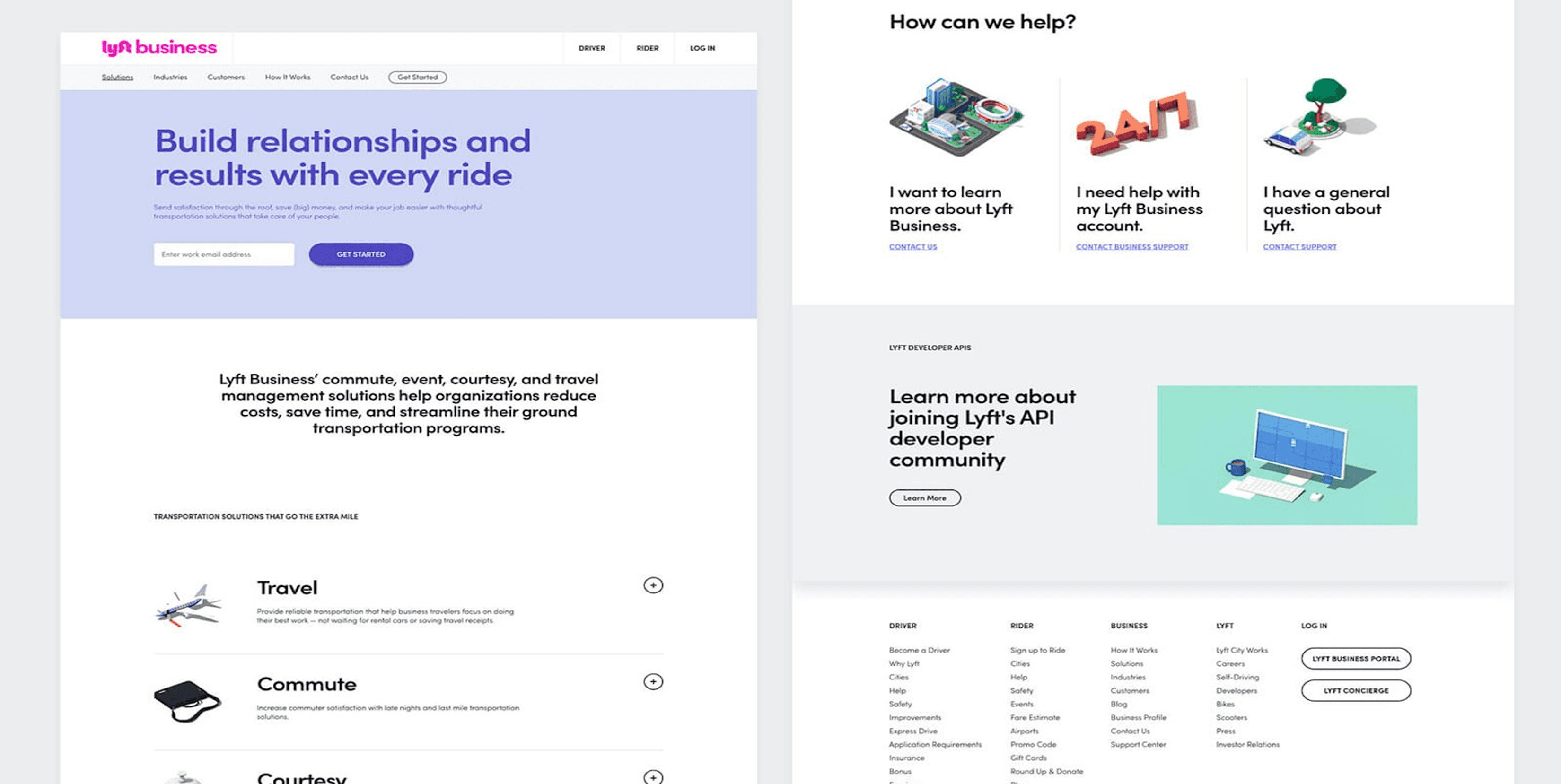
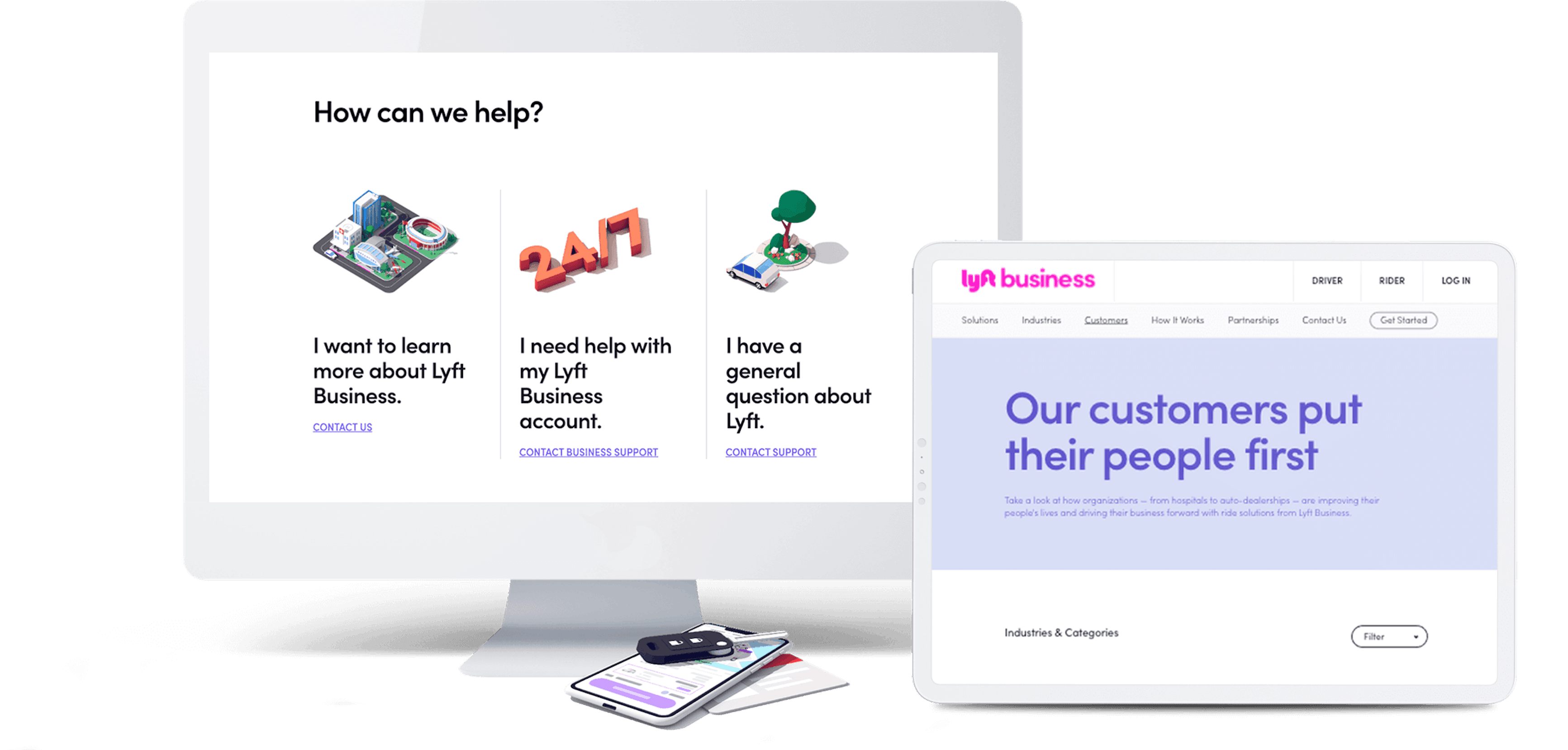
Lyft might lead the pack in ride-sharing, but the Lyft Business channel wasn’t in sync with the rest of the brand. Plus, its audience is all over the map—think hospitals, the Hollywood Bowl, Fortune 500s, airports, and more. We had to create a clear, tailored journey for each group, all while making sure the site finally felt on-brand.
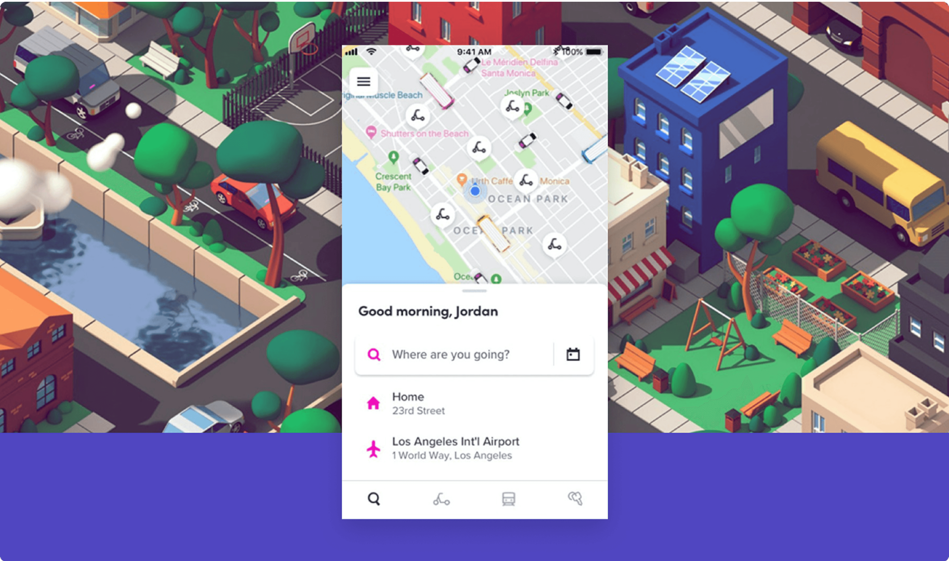
We took a hands-on approach, diving into the ins and outs of ride-sharing and business partnerships across all kinds of markets. The site content got a major overhaul for clarity and engagement, highlighted by a new “How it Works” section that breaks down Lyft Business’s four key solutions into an easy-to-follow story. At the same time, we zeroed in on two big goals: driving up lead conversions and building a distinct Lyft Business identity that still felt right at home with the larger Lyft brand.
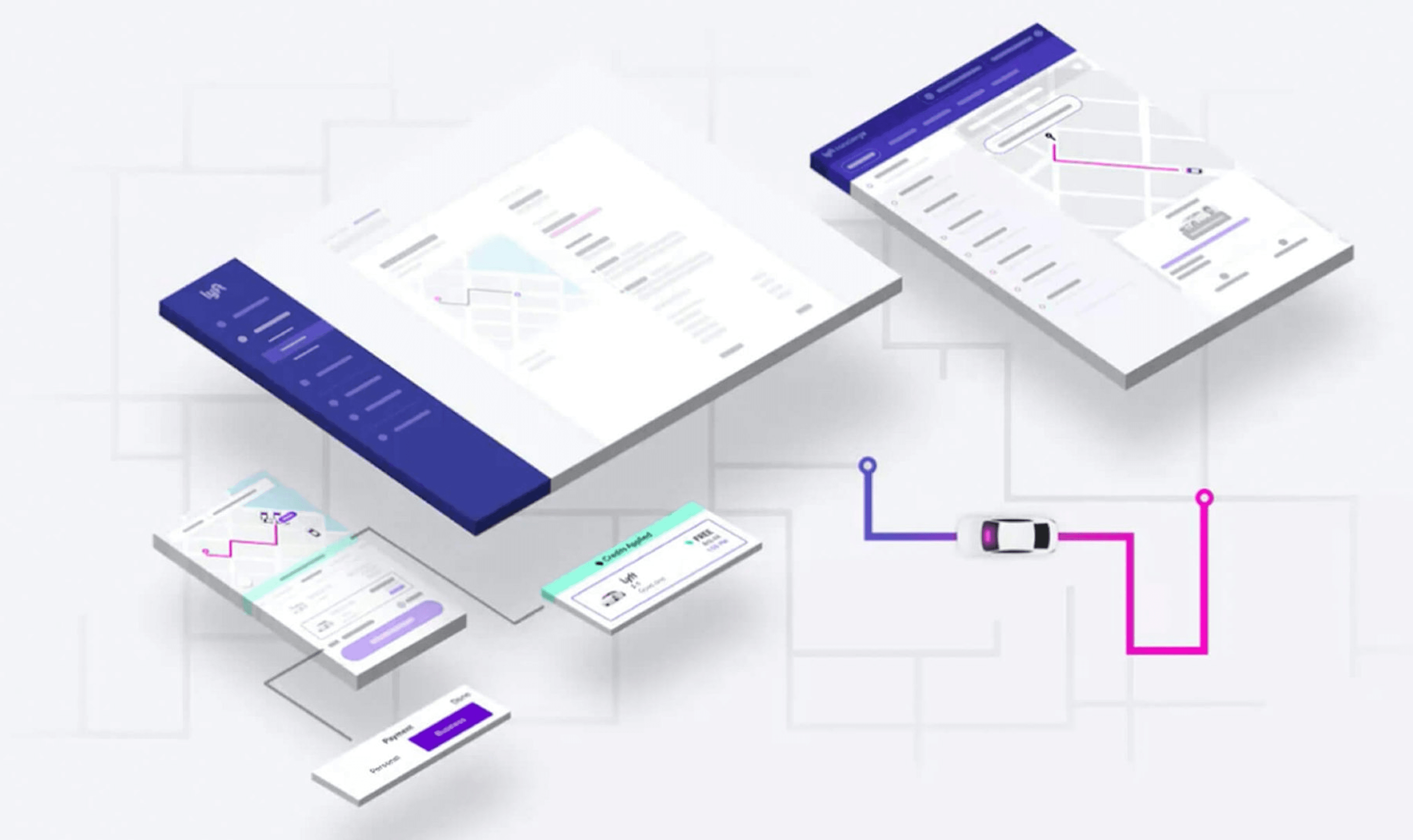
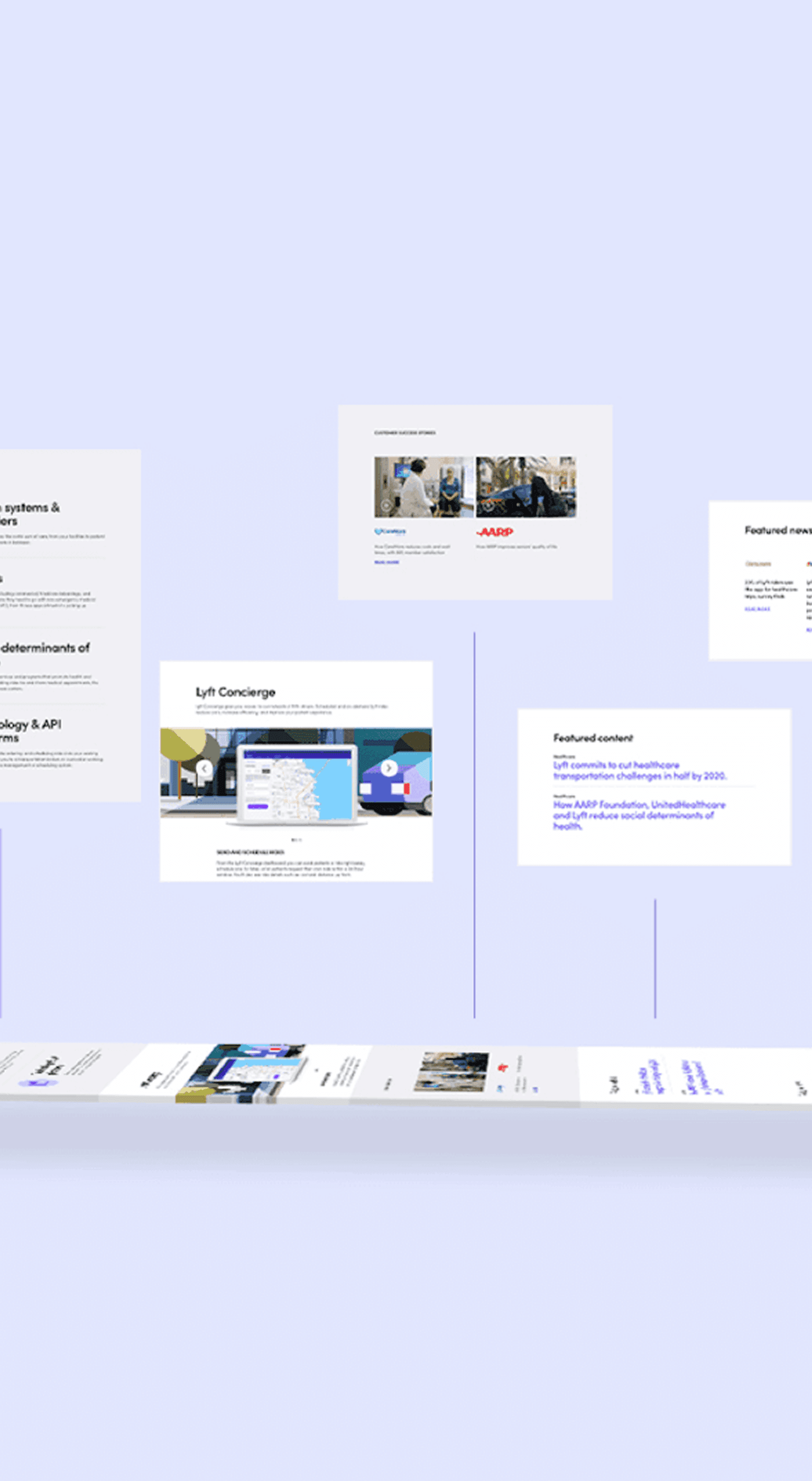
Building on Lyft’s refreshed brand colors, we crafted a unique visual identity for the Business channel that still nodded to the core brand guidelines. We pushed the main site format further, creating a robust library of custom modules to handle the site’s deeper, more complex content needs. Making sure everything felt unmistakably “Lyft” meant expanding and fine-tuning the visual language—so every new use case and audience felt right at home.
We obsessed over every detail to make sure the build matched the design down to the pixel. The site runs on a fast, secure server and all images and videos are fully optimized to resize automatically for lightning-fast load times. With a custom CMS built just for Lyft Business, the team can easily keep everything up to date as their needs evolve.
We made sure every image, every graphic, is retina optimized. The site looks sharp and stunning on any high-density display. No matter where you’re viewing, you get that crisp, premium feel.
This site flexes for any screen. Desktop, tablet, or phone—it just works, looking clean and feeling seamless no matter how you access it.
Accessibility wasn’t an afterthought. It was baked in from the jump. The site meets ADA standards, making sure everyone can use it, navigate it, and feel included.
We built a custom CMS that actually makes sense for real people. Updates are a breeze, and the client can keep things fresh and current without breaking a sweat.
Speed matters. So we hooked the site up to CloudFront CDN, pushing content out through Amazon’s global network for faster load times everywhere and rock-solid reliability.
We set up custom sales funnel tracking with Google Analytics, so every step of the user journey gets measured. That means smarter A/B testing and constant tweaks for better conversions.
Smart SEO runs through every corner of the site—content and code—so your products are easier to find and your rankings climb higher. It’s built for visibility right from the start.
Lyft Business is just one chapter in our ongoing partnership with Lyft. We brought brand and business into true alignment and overhauled the site map to clearly showcase their business offerings. Today, our collaboration continues as we help drive higher lead conversions and keep the site evolving—all while Lyft keeps redefining what’s possible in ride-sharing.
Partner Feedback

The Lyft Business digital channel was out of sync with the broader Lyft brand and needed to serve a wide range of audiences — from hospitals and airports to Fortune 500 companies. Metajive created tailored user experience journeys for each audience segment while bringing the entire site into full brand alignment. The engagement spanned over seven years (2017–2025), making it one of the longest continuous agency partnerships in Lyft's history.
Metajive provided comprehensive digital services including strategy, UX research, journey mapping, information architecture, wireframes, website design, motion graphics, responsive web development, ADA accessibility compliance, CMS implementation, SEO optimization, and performance optimization. The engagement covered the full product design lifecycle from research through ongoing refinement.
Building on Lyft's refreshed brand colors, Metajive crafted a distinct visual identity for the Business channel that extended the core brand guidelines while establishing its own presence. The team built a custom library of modular components to handle complex content needs across multiple audience segments — enterprise, healthcare, government, and transportation.
The site includes retina-optimized images, fully responsive design, ADA compliance, a custom CMS built specifically for the Lyft Business team, CloudFront CDN integration for fast global load times, sales funnel tracking via Google Analytics, and SEO optimization throughout the content and code architecture.
Metajive focused on two goals: increasing lead conversions and building a distinct Lyft Business brand identity that felt cohesive with the larger Lyft consumer brand. Every user experience decision was evaluated against these two metrics — conversion rate and brand perception.
Metajive maintained a partnership with Lyft spanning over seven years (2017–2025), continuously evolving the Lyft Business website alongside the brand. This longevity reflects deep trust and consistent delivery — the Lyft marketing team praised Metajive for 'consistently delivering industry-leading work on great turnaround times.'
The custom CMS was purpose-built for Lyft Business, giving the team full control over content updates without technical hurdles. As Lyft Business expanded into new audience segments and use cases over the seven-year engagement, the CMS scaled with them — no developer bottleneck required for routine content changes.
