

NEA (New Enterprise Associates) is a major player in venture capital, backing companies from their very first round all the way to going public. What really sets NEA apart is how they build real relationships with founders and partners, making sure their support delivers long-term value.
Services
Strategic workshops + alignment sessions
User Experience (UX)
Information architecture & wireframes
Website Design
Design systems & scalable components
Accessibility + inclusive design
SEO
2D/3D illustration + animation
Responsive Web Development
Full-stack web development
Headless CMS implementation
Analytics & Personalization
NEA has been investing in standout start-ups since 1977, but the truth is, their name still flies under the radar in the industry. In a sea of venture firms that all sound the same, we had to figure out what really makes NEA different and help them stand out in a crowded capital market.

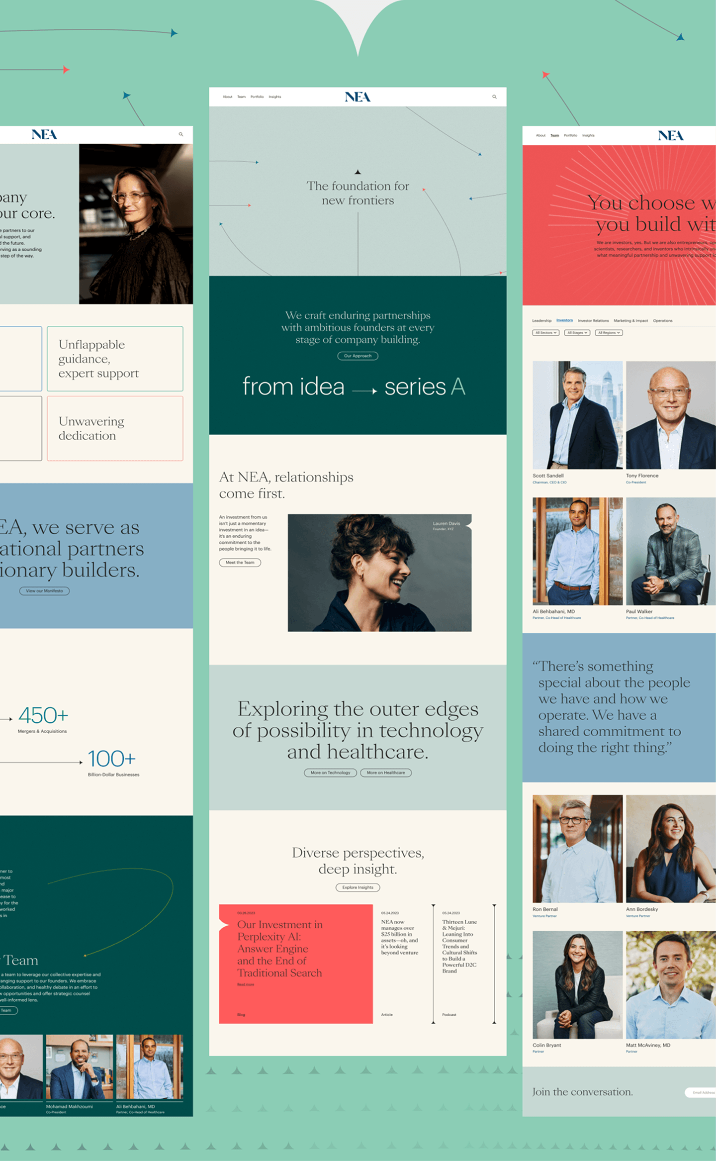
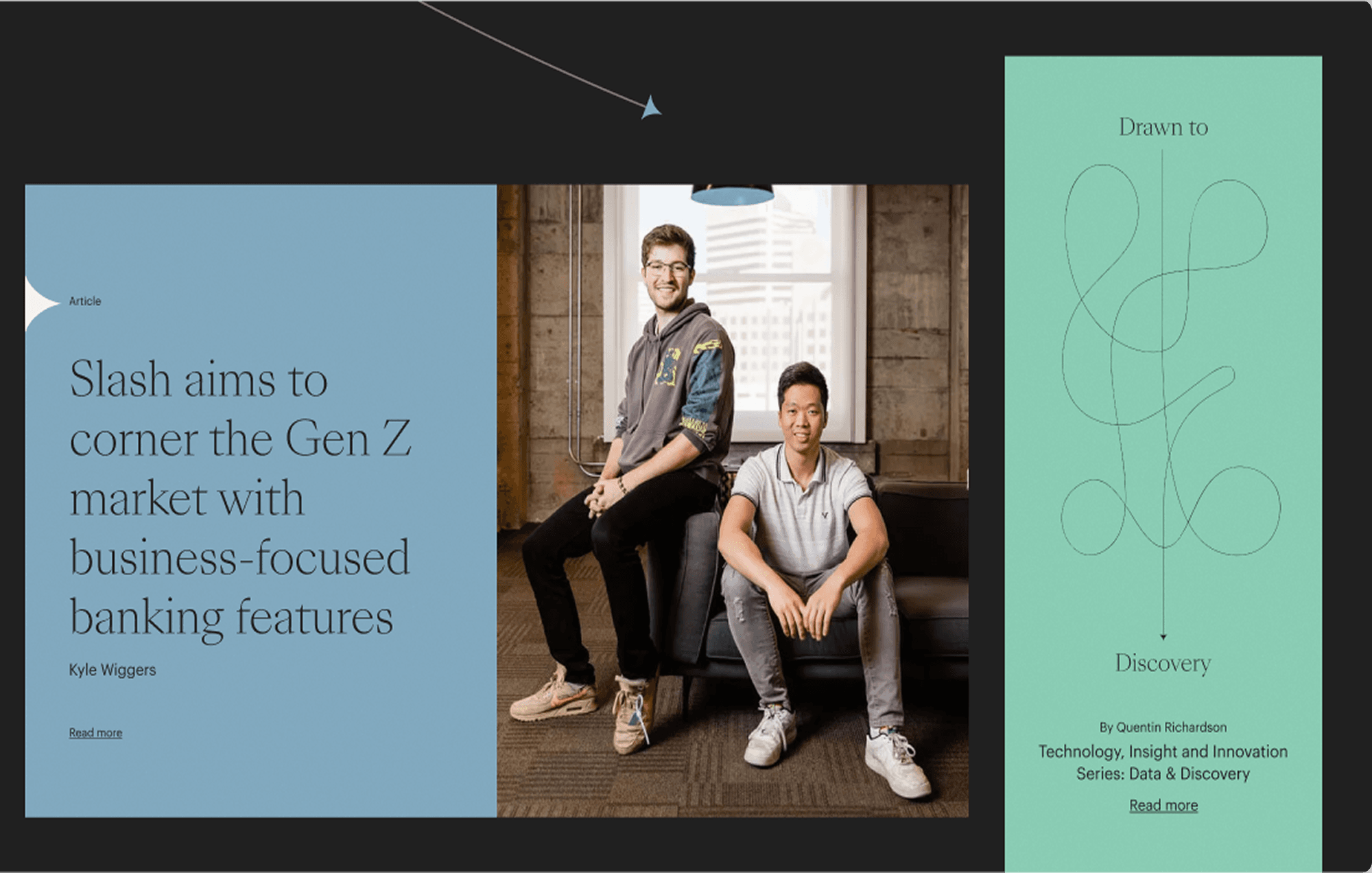
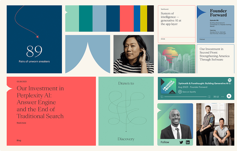
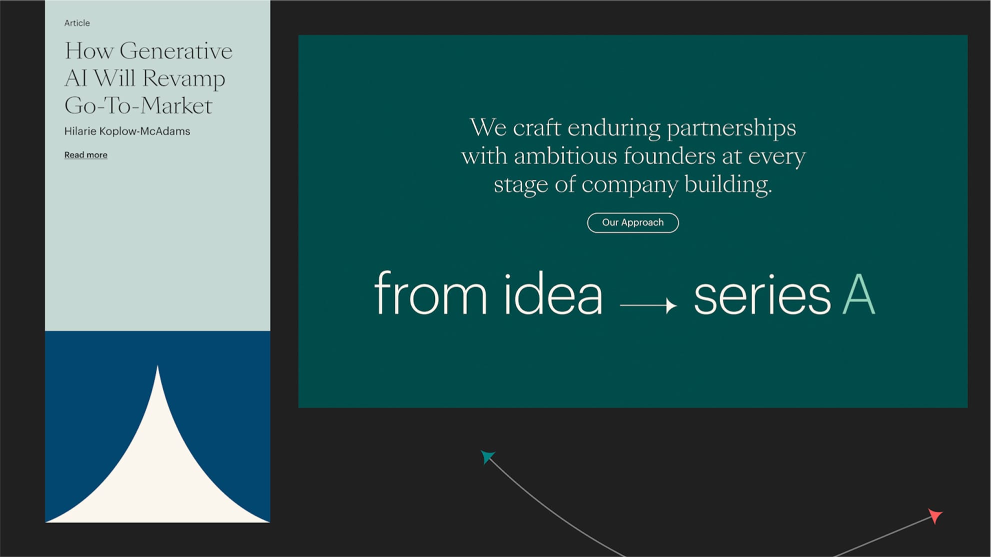
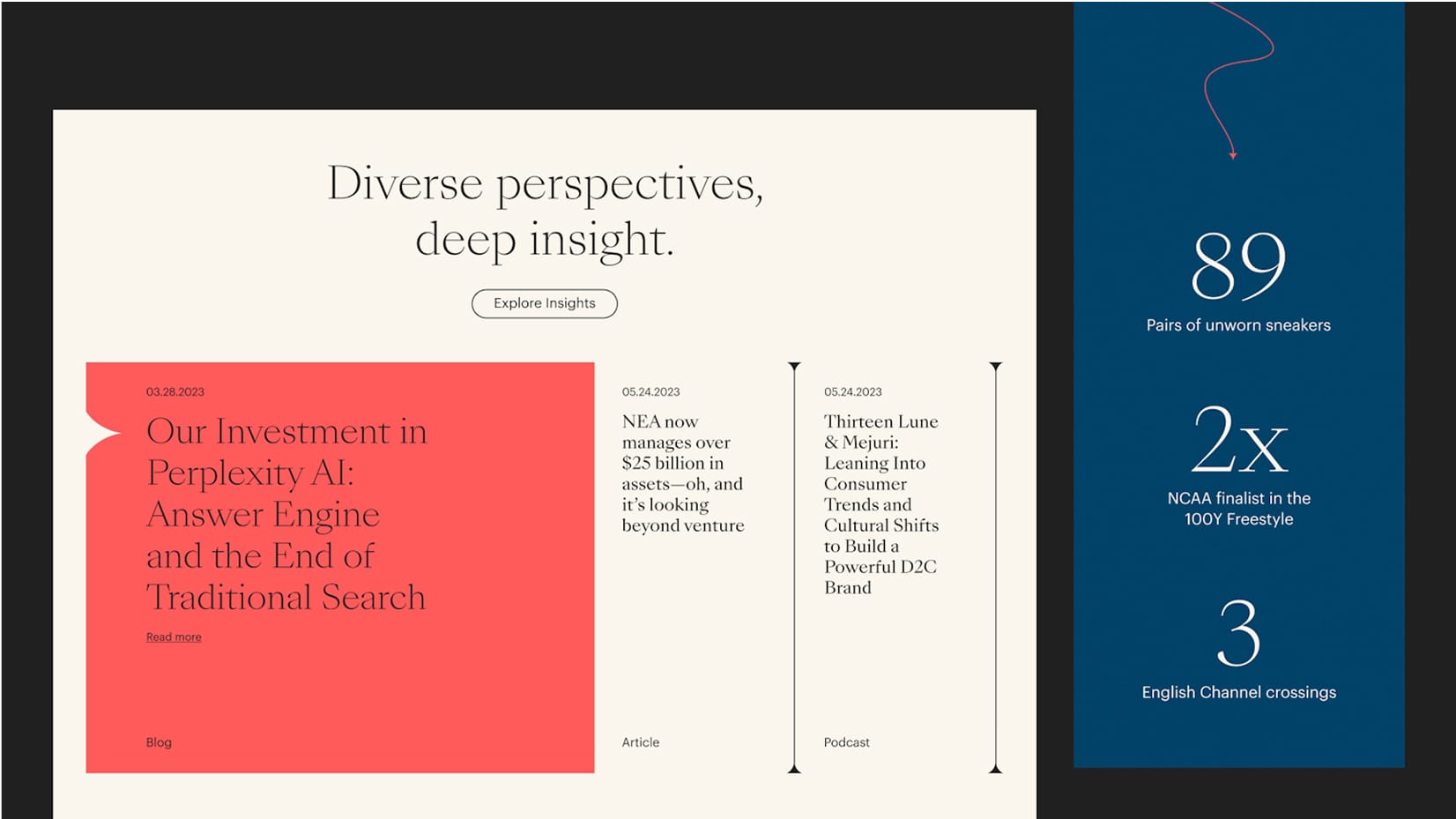
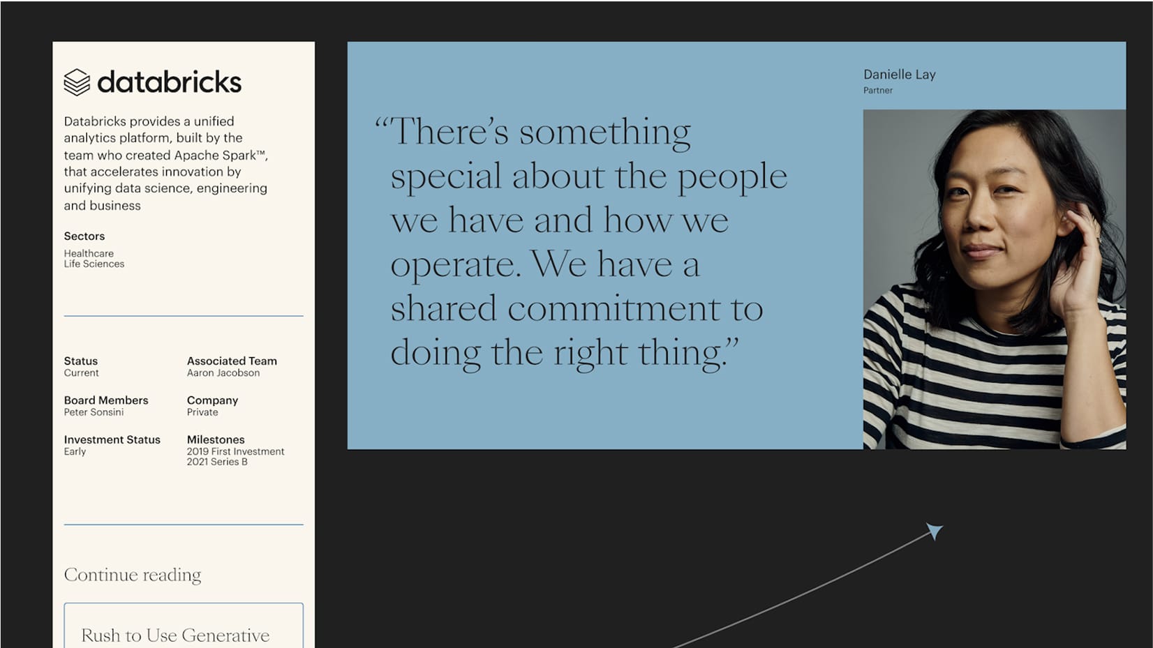
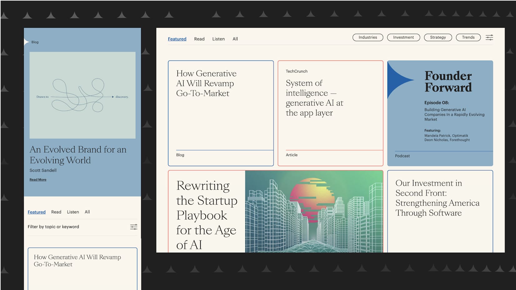
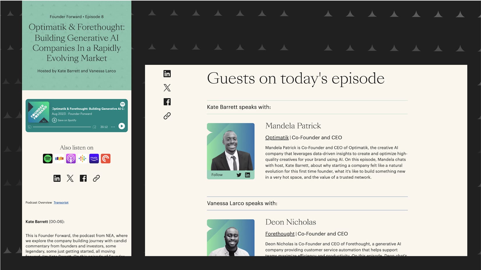
To show off what makes NEA different, we put the spotlight on their founders and the expertise they bring to key industries. We kept the content architecture simple and focused, letting the work and results speak for themselves. The design is clean and forward-thinking, making NEA’s value clear without any extra fluff.
-
Building on the brand our friends at Mococo started, we wove in elements that capture NEA’s role as a true guide for its partners. We took the arrow from the logo and turned it into a visual thread, creating assets that look sharp and instantly communicate big ideas.
-
Consistent photography of NEA’s team and founders helped us put real faces to the brand and highlight their collaborative spirit. The design stays light and optimistic, but we introduced darker tones where it made sense—like switching to dark mode for the search experience, which made everything pop and feel even more usable.
We built this site on a Statamic Headless CMS with a NextJS frontend for top-tier speed and flexibility. Automated content migration made the switch seamless, and the custom hero animation lets you tweak settings for an interactive touch. We used open-source Meili Search to give users smarter, faster navigation. Plus, a built-in newsletter signup makes it easy for NEA to keep their audience in the loop.
We set up blazing-fast servers so your site loads instantly and runs smooth, no matter the traffic. Every user gets a responsive, reliable experience—right from the first click.
We picked Statamic for its flat-first setup, giving the client super simple content management. Updates and deployments are a breeze with its smart interface and Git integration.
This site is built to be fully responsive, so it looks sharp and works smoothly on any device—desktop, tablet, or phone. No matter how you access it, the experience is seamless and visually spot-on.
We used SVG illustrations to keep visuals crisp while cutting down on file size. The site loads faster and graphics stay sharp on every screen.
A living toolkit of components and guidelines that keeps every digital product on-brand and consistent. We build these so teams can move fast, design smarter, and deliver a seamless user experience every time.
The front-end runs on Next.js for top-notch performance. Navigation is quick, interactions are smooth, and the overall experience is just better.

We organized the content so it speaks to investors, regulators, and founders while boosting the NEA brand at every turn. And we’re not stopping here. As the venture capital world keeps changing, we’re partnering with NEA to keep evolving the site and stay ahead of the curve.
NEA (New Enterprise Associates) is a major venture capital firm that has been backing companies since 1977, supporting founders from seed funding through IPO. The firm manages billions in assets and has backed some of the most successful technology companies in history.
Despite NEA's long track record, their name still flew under the radar in a crowded venture capital market where many firms sound the same. The core challenge was product design that communicated what genuinely sets NEA apart — their founder-first approach and deep industry expertise — without relying on generic VC messaging.
Metajive put the spotlight on NEA's founders and industry expertise, keeping the content architecture simple and focused so the work and results could speak for themselves. The user experience was designed for three distinct audiences — investors, regulators, and founders — while reinforcing the NEA brand throughout.
The site runs on a Statamic Headless CMS with a Next.js frontend, paired with open-source Meili Search for faster navigation and automated content migration. The architecture provides a clean, modern development foundation with fast performance and flexible content management.
Metajive built on branding started by Mococo, taking the arrow from NEA's logo and turning it into a visual thread throughout the site. The arrow motif captures NEA's role as a guide for its portfolio companies — a subtle but effective design decision that gives the site a distinctive identity.
No. Metajive continues to partner with NEA to evolve the site as the venture capital landscape changes. This ongoing relationship follows the same pattern as Metajive's multi-year partnerships with Google, Lyft, and HP — launch is the beginning, not the end.
The content is organized to address three distinct audiences — investors, regulators, and founders — while reinforcing the NEA brand throughout every section. The user experience provides different entry points and content paths for each audience without fragmenting the overall site experience.